
As we continue to navigate our lives online, the ways we connect people continue to change. It is more important than ever to have an engaging digital presence to interact with your followers. A critical part of this is utilizing effective graphics. Social media graphics have the unique ability to convey your message efficiently without the need for a lengthy text. Here are six things to consider when designing your next social media graphic.
Rely on images, not words
The phrase “a picture is worth a thousand words” has never been truer. With a limited amount of characters, a high-quality photo can convey a message more effectively than a long slew of words can. Too many words can overwhelm the viewer and bog down the graphic. An image has the power to engage the viewer beyond just reading the message.
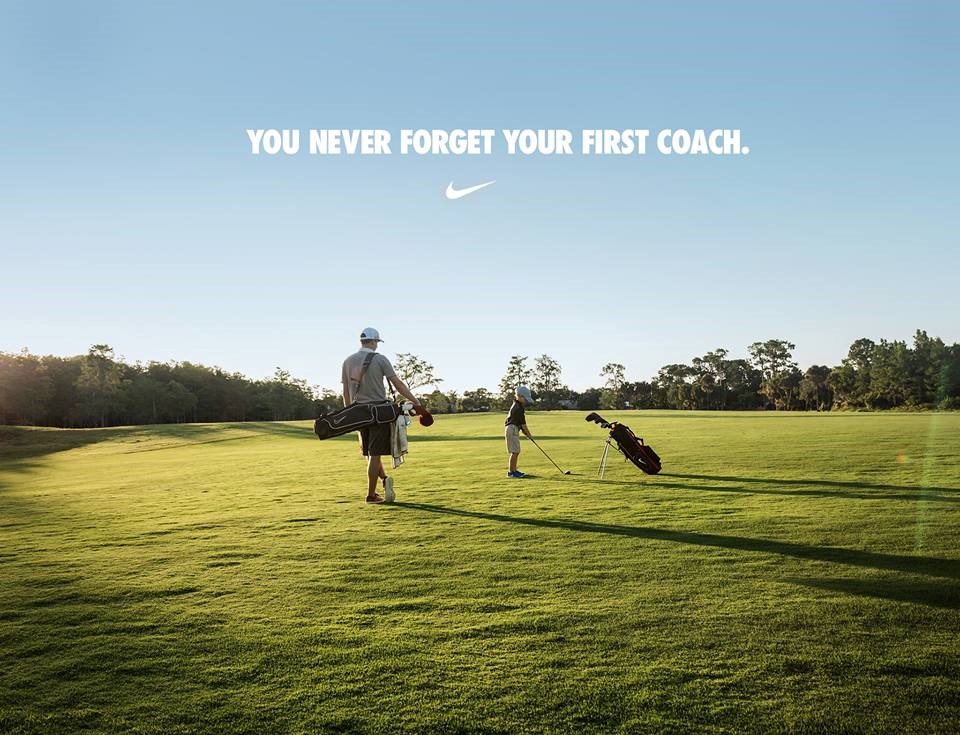
Why this works: The image conveys the strongest message in this post. It elicits an emotional and nostalgic response from the reader. There’s a total of six words in the ad, and they serve to supplement the image. Eliminating the text and keeping the logo with the image would still convey the same message and resonate with the same audience.
Make a Call to Action
Don’t waste your viewers’ time. If they took the time to view your graphic, give them a way to immediately engage with it. This can be as simple as creating a button to like your page or directing them to something you want them to interact with on your website. This not only increases online traffic to your pages but also makes the viewer feel more involved with your establishment.

Why this works: This is a very simple graphic but has a clear call to action emphasized in the center of the page and highlighted in color. It leads the audience to interact with the graphic and ultimately, the company.
Use a High-Quality Image
I cannot stress this enough: using a low-quality image is the quickest way to make your social media graphic go from sleek and professional to unattractive and amateurish. If you see a single pixelated section of your picture, scrap it. If you took your own photo, either reshoot it or use one of the thousands of free stock images online. Websites like Pixabay have a variety of high-resolution images that you can choose from to fit your message. With the image being the most critical part of the graphic, it must outshine the rest and a low-resolution, a pixelated image will not do that.

Why this works: This would be a perfect high-res image to integrate into a social media graphic. It’s a stock image that has a crystal clear, attractive focus and enough negative space to add text that would mesh with the photo.
Brand the Image
The ultimate goal of a social media graphic is to drive traffic to your page. If people are viewing the graphic on your page then this goal already accomplished. The issue comes when a follower shares your image and the audience views it on a profile that is not yours. The graphic does no good if someone looks at it and can’t connect it back to the source. This doesn’t mean that you need to throw a bulky logo on every graphic you make, but people need to be able to connect it back to you.
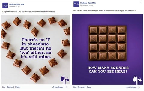
Why this works: Cadbury has done an incredible job branding these graphics without obnoxiously calling attention to their brand. They utilize a consistent color scheme that is easily recognizable. Their logo is also branded on each chocolate square in case there was any doubt about who’s ad this is.
Use a Cohesive Color Palette
Colors can make or break an image. Using too many dull colors will lose your audience and an array of bright colors will often overwhelm them. An effective graphic will combine these two and use color to highlight the main message of the graphic. Images with colors in a similar family along with an accent color will attract the viewer and direct them exactly where they should look.
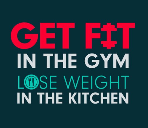
Why this works: This graphic is extraordinarily simple but is effective at using color to quickly get its message across. The main message here is to get fit. While another color in the frame is a cool color, the message is highlighted in a vibrant red that the viewer’s eye can pick up on in a split second.
Utilize Negative Space
It may seem like a good idea to pack any empty space full of text so that the viewer gets as much information as possible. Here’s the problem with that: it’s a small space. Too much text will overcrowd the graphic and overwhelm the audience. You need to hone in on your message and cut down as much text as you can. Leaving the message short and concise will leave the viewer wanting more and encouraging them to interact with your page.
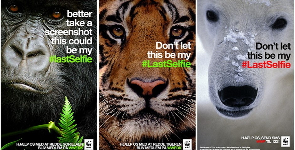
Why this works: These images all have one small block of text and the rest is negative space. It’s extremely effective because, again, the images increase the power of the message and are best left unobstructed by lengthy text.
About the Author | Lance is a fifth-year senior seeking dual degrees in Communication and Media & Information. He has been a PR and Graphic Design Intern with Grassroots Midwest since April 2016. After he graduates in December he hopes to go on and work in the nonprofit sector or doing public service. Along with his work with Grassroots Midwest, Lance works as the Office Student Coordinator for MSU’s Academic Orientation Program and is an Associate Producer for MSU&U, a student-run news show.